Calculated Fields in Excel Pivot Tables

Pivot tables in Excel are awesome. I love them. Drag, drop, slice, and dice data in seconds. Create charts and graphs. Amaze your friends. It’s all about the pivot tables, baby!

Occasionally, you need more than just the data, though. You need to know the difference between two numbers, or the percentage of one number relative to another. This is where Calculated Fields come into play. I haven’t had a huge need for them in my previous pivot tabling, so I never really knew about them. When I needed a calculated field, I would create a column with the calculation I needed in my source data, and that worked fine.

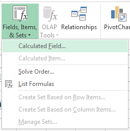
Today, though, I accidentally discovered Calculated Fields, and they are sweet. All you need to do to create a Calculated Field is click on the Fields, Items, & Sets menu in the pivot table ribbon, and select Calculated Fields…. This will open a new dialog box that allows you to create a named field generated from a formula you create from the already-available pivot table fields.

Once created, your Calculated Field is available in the Pivot Table Fields list for you to use as data in your pivot table!

Best Browser for Low Resource Computer

My wife and I keep a netbook in our living room for lightweight, everyday computing. It is used almost exclusively for checking email and general internet browsing. The specs on the netbook, like most netbooks, are not terribly impressive: 1.66 GHz CPU, 1 GB RAM. It’s been a good, little computer, but recently the performance has become a problem.

My wife and I both use Chrome as our primary browser. When I pick up the computer, and there are a bunch of tabs left open by my wife, I leave them open under the assumption that they were left open intentionally, and my wife gives me the same courtesy. I know that Chrome runs each tab as a separate process, and I suspected that the large number of tabs that were frequently open might have been causing our performance woes. I decided to do some resource testing with each of browsers installed on the netbook: Internet Explorer 9, Chrome, Firefox, and Safari.

For my test, I opened each browser with three tabs and browsed to my Gmail inbox with each. I wanted to see how many processes were created by doing this and how much total memory was used by each browser in doing so.

  • Chrome: 5 processes (for 3 tabs), ~40K memory each
  • Internet Explorer: 3 processes, ~30K memory each
  • Firefox: 1 process, ~115K memory
  • Safari: 2 processes (for 3 tabs), ~20K memory
    • …but also WebKit2WebProcess.exe: 1 process, ~120K memory

So, my hypothesis is that Chrome is actually the worst browser to use on a low resource machine since it spawns the most processes and uses the most memory per process. Internet Explorer and Firefox seem like they may be a push. My guess is that Firefox will outperform IE on a low-end machine since there is only a single process, but I have not tested this or even spent much time thinking about it. Safari seems like the wild card in the equation. It uses the least amount of memory per process, but it relies on the separate WebKit2WebProcess process which seemingly offsets the per-process memory savings.

This article seems to support my claim, stating that Firefox is the best choice for users with less than 2 GB of RAM. That article linked to another article on the same site about reducing Chrome’s memory usage, which would obviously improve Chrome’s performance on low-end hardware.

Office 2013 Preview Display Issues Resolved!

I’ve been using Office 2013 Preview since last week, and I’ve been generally happy with it. There have been a number of quirky display issues that have had me seriously considering reverting back to 2010, though. Scrollbars weren’t displaying properly, drop-down picklists weren’t showing up; there weren’t significant issues, but they were definitely usability problems.

I was sitting in on an educational lecture this morning and figured I’d use the time to install some updates. I’m currently using a Lenovo W510 laptop, and I run the Lenovo System Update utility from time to time to grab the latest drivers and system software. After installing several updates, all my Office 2013 display problems were resolved!

I can only speculate which update is responsible for fixing these issues, but I thought I’d include the list from my installation history in case others are experiencing similar display problems. (Click the image to see full size.)


Additional system info: Win7 64-bit, Office 2013 Preview 32-bit

Fix OCS 2007 R2 Integration with Outlook 2013 Preview

As noted last week, I installed the Office 2013 Preview and was generally excited about it except for the fact that I wasn’t getting any presence information for contacts from Lync. I assumed this was because I was using an unsupported configuration with my 2010 Lync client connecting to an OCS 2007 server.

I decided that Office 2013 was more important than Lync 2010 and reverted to OCS 2007 in hopes that it would fix my woes, but it did not. After a bit of Googling and tinkering, though, I was able to find a solution to get things back on track.

There’s a registry key that lets Outlook know what the default IM provider is, and this value was set to Lync on my workstation. In looking at the two sub-keys, I could see “Lync” and “Communicator.” So, I took a guess and changed the value to “Communicator,” restarted Outlook, and–voila–I was in business!

Here’s the full registry key and value that I changed to fix it:

[HKEY_CURRENT_USER\Software\IM Providers]
"DefaultIMApp"="Communicator"

Just as a recap, here’s what I had going on:

  • 32-bit Office 2010 w/ Lync 2010 client and this registry hack on 64-bit Win7
  • Upgraded to 32-bit Office 2013 Preview
  • Uninstalled Lync 2010, installed Communicator 2007 R2
  • Removed the aforementioned registry hack
  • Made the registry changed noted above
  • Restarted Outlook, restarted Communicator

Update 10/26/2012:
I upgraded to the RTM version today, and OCS 2007 R2 is still functional.

First Look: Office 2013 Preview

Well, I did it. I took the plunge and upgraded to the Office 2013 Preview. So far, I’m pretty happy. It took me some time to get used to the bright white interface, but everything feels shiny and new now that my eyes have adjusted. I’ve had a few hours to play with it, and I wanted to offer my first impressions.

As noted previously, the first thing you’ll notice when you open any of the new applications is the white-on-white design. The lack of contrast is really distracting at first, and I’m not sure if this is a feature of the preview or if this is how it will look in the final product. Microsoft has introduced some themes that allow you to add a small embellishment to the ribbon area, but the themes don’t affect window color at all. I’m not that into any of the themes, but here’s a post that gives you a quick look at what’s available, if you’re curious.

The applications all have the same look & feel, but there were a few new suite-wide features. One of my favorites was the animated cursor. This was interesting to me, and modifying the cursor behavior is not something that ever would’ve occurred to me. It’s neat, though. When you type, the cursor slides to the right. When you hit enter, it slides down to the next line. It’s weird, but it makes typing in Word and Outlook feel like an enhanced experience.

The next significant feature I came across was the weather in Outlook. You read that right: the weather. I was looking at my calendar and noticed temperatures and a graphical forecast. It’s hard to say how useful this will be since I’m not used to having access to weather in my calendar, but I’m excited about it! There’s a fade-and-slide-in effect that occurs when switching between areas in Outlook (Mail, Calendar, etc.) that feels slick, but I haven’t noticed much else that’s changed aside from the appearance.

With both Word and Excel, I was most excited about the new document templates. In both applications, the templates presented allow you to create legitimately good-looking and functional documents. The screenshot below shows the “family budget” Excel template, which includes a worksheet for setting up categories, a worksheet for tracking income and expenses in the categories, and a dashboard worksheet that includes summary data complete with charts and graphs! This is way better than the budget spreadsheet I whipped up a few years ago.

What’s also great about the templates is that they walk you through how to use them effectively. For example, there’s a “student report” template in Word that has in-line instructions for adding graphics, adding a table of contents, and adding a bibliography. How cool is that?!

Another much-improved feature in Word is the comments. Comments now flow like a conversation. You can see who made what comments, and you can reply. Replies show as nested responses, so it’s easy to follow what’s been happening. This will be very helpful when passing documents back and forth for review.

OneNote has been arguably my favorite Office app since I started using it in 2007, and I’m happy to report that the improvements to OneNote in 2013 seem great. The first thing that happens when you open it for the first time is you’re asked to connect to SkyDrive. Sync everything to the cloud and make it available everywhere automatically? Yes, please! The colored tabs look nicer, and they actually work well with the new very-very white theme. Some screen real estate has been freed up by moving the notebook tabs on the left part of the screen to a drop-down next to the section tabs beneath the ribbon. Everything feels a little more polished except the cursor when you type; it doesn’t slide along like in Word and Outlook. That made me a little sad, but maybe they’ll get it into the final version.

OneNote does have some other cool features, though. I’m not sure if this was in the previous versions or not, but I was pretty impressed with the “Ink to Text” and “Ink to Math” features. These are what they sound like: draw some text or math with the mouse/stylus/etc., and OneNote converts it to what you meant. Very cool.

The only disappointment I’ve had with the new Office is that integration with Lync is broken. To be fair, I’m using an unsupported configuration (Lync 2010 client connected to OCS 2007 server), but it’s still unfortunate. My IM conversations are still recorded, but I’ve lost contact status in emails and meetings. I’m sure this will all be fine once we upgrade to Lync.

Overall, I’m pretty excited about the new version of Office. I’m looking forward to using it over the next few months and exploring the new features. Are there cool features that you’ve discovered with this new version of Office? Please share–I’d love to hear!

Keep an Open Tab at Starbucks


On yesterday’s news, there was a teaser about how Starbucks was going to change how we pay for things. “This is old news,” I thought to myself, “they’ve already done that with their mobile app.” I was curious about the story but forgot about it before I actually heard the details.

On this morning’s news, I saw a headline about it: “Starbucks partners with Square.” Until today, I’d never heard of Square, so I did a quick Google search and found this article at NYTimes.com. I gotta say, it sounds pretty cool. This quote from the article does a good job of summarizing how Square will change how you pay for your coffee:

At first, Starbucks customers will need to show the merchant a bar code on their phones. But when Starbucks uses Square’s full GPS technology, the customer’s phone will automatically notify the store that the customer has entered, and the customer’s name and photo will pop up on the cashier’s screen. The customer will give the merchant his or her name, Starbucks will match the photo and the payment will be complete.

That’s amazing! I just tell them my name, and they can look me up in a proximity-based list of users with photos to collect payment. It’s like having an open bar tab at Starbucks but more secure because of GPS and photo identification. It’s more secure than the current Starbucks app, too. Anybody with access to my phone today can walk into Starbucks and buy a drink with the app. With this, you’d need to have my phone and look like me.

Microsoft Introduces Outlook.com

As I was catching up on my current events on CNN, I noticed an interesting headline on their bottom line: “Microsoft replaces Hotmail with Outlook.com.” After I missed out on the ideal Twitter name, I made a decision to always sign up for new services right away regardless of how much I think I’ll use them. So, with the announcement of Outlook.com, I wanted to get over there ASAP and stake my claim! Unfortunately, “adam@outlook.com” was already taken, but I still  took the chance to look around and explore some of the features.

Overall, the UI is quite nice. It feels very crisp and clean, much like the upcoming Office 2013. I wasn’t a Hotmail user, but my Live account was already setup for it, although I wasn’t receiving any email since I hadn’t connected any of my existing email accounts. As I said before, my goal was to get my “@outlook.com” email addresses, and it took me a minute to figure out how. You need to click “More mail settings” under the configuration menu in the upper right corner, and then click “Create a Outlook alias.” (C’mon, Microsoft–do a grammar check! Create an Outlook alias!) You’ll be taken to a screen with a [textbox]@outlook.com prompt, and you can claim your name. Note that you can create multiple aliases, so you may want to grab firstname.lastname and firstnamelastname or whatever other nicknames you might want. (I was hoping they’d make period placement in email addresses irrelevant like gmail, but it appears they didn’t.)

I’ve only spent a few minutes with it at this point, but here’s what I like so far:

  • Multiple @outlook.com aliases
  • Drag and drop messages and folders
  • Keyboard shortcuts
  • Clean UI/look and feel

If you’re a fan of the offline Outlook experience, you’ll probably really like Outlook.com. It’s definitely worth checking out!

Change the Default Text of Controls in Word Templates

One of my pet peeves is when people create and distribute MS Word forms that don’t use controls for the fields. It’s a very easy thing to do, and everybody will be happier to use your form. What makes that form even nicer, though? Changing the default text of your field controls to be friendly and more indicative of what information is being requested.

This is a relatively simple task, accomplished in just 4 very easy steps:

  1. On the Developer tab in the ribbon, enable Design Mode by clicking the toggle button
  2. Select all the text between the prompt tags; be sure to select the text while in design mode, otherwise you may change the font/color of your text to something other than the prompt default
  3. Type the desired prompt text
  4. Disable Design Mode by clicking the toggle button

Use this tip to instantly improve that quality of any Word document form. Share it with your co-workers; they’ll be impressed!

Credit: this is the post where I picked up this little nugget of information.

Adobe CreatePDF Subscriptions: Why?

I was reading a PDF this morning and noticed a new button in the latest version of Adobe Reader: “Convert file to PDF using Adobe CreatePDF online.”

“Oooh,” I thought to myself, “Has Adobe finally provided us with a free and convenient way to create PDF documents??”

I promptly directed my browser to Google and searched “Adobe CreatePDF” and clicked the first result. At the top of Adobe’s landing page, there’s a button to “Create a PDF now” that takes you to… their subscription page? Really?

I guess this isn’t surprising, but it is disappointing. The list of features provided include converting Word DOCX files and Excel XLSX files. Of course, both Word and Excel come with this capability built-in via the Save As command, so these features merely provide me with a less convenient way to convert my Office documents to PDFs.

Maybe this would be good for a non-Officer user who needs to view Word and Excel documents, though? Not in my opinion. OpenOffice.org opens these file types and lets me do the same conversion via its Export function. This is actually how I used to create PDFs before Microsoft included the capability into Office. Google Drive (formerly Google Docs) also lets you download copies of files as PDFs.

If you are going to charge for this — which, clearly, you are — why not make it more affordable? $89.99 annually seems pretty steep, especially if you compare it to products like Adobe’s own ExportPDF which allows you to go the other direction, converting PDFs to Word or Excel for just $19.99 annually. I wouldn’t be interested in paying a one-time fee of $89.99 for this, and, frankly, ExportPDF seems like the more valuable of these two products!

So who is this product’s target demographic? I simply can’t come up with a reasonable answer. To me, this represents Adobe preying on users that either don’t realize this functionality already exists in the latest versions of Office or aren’t resourceful enough to use free alternatives like OpenOffice.org and Google Drive. If this had been a free offering, I’d be writing a different article praising Adobe for making this available. Users needing to create professional-grade PDFs are still going to purchase licenses for Acrobat, so why not just make this available for the non-professionals to keep PDF adoption and accessibility rates high? Maybe I’m failing to pick up on the key features or benefits, but I simply don’t get it. Am I missing something here?!

Online Font Converter

I was looking to spice things up with a new font in Visual Studio, but I ran into a slight snag: the font I wanted to use–Inconsolata–was an OpenType font and wouldn’t display in the Fonts and Colors settings in VS.

I found this handy post that directed me to an online font converter that worked swimmingly. Nice!